Transform Your Novel: 10 Book Cover Design Hacks Unveiled!
Each novel breathes a unique spirit, and an alluring book cover serves as its public face, inviting readers into its intricate world. If your novel has been crafted with diligence and passion, it unquestionably deserves a cover that eloquently communicates its core essence.
I’ve navigated through the thrilling voyage of designing and understanding deeply the importance of a harmonious alignment between your words and the cover that houses them. As an experienced book cover designer, I'm thrilled to unveil 10 transformative hacks that promise to revolutionize the way your novel presents itself to prospective readers. Let’s embark on this transformative journey together!

Make it stand out
Whatever it is, the way you tell your story online can make all the difference.
The Power of First Impressions
First impressions are crucial, particularly with book covers. An enticing cover immediately provides readers with a glimpse into the adventure and mystery waiting within the pages. Not only does it initiate the story, spark interest, and set expectations, but it also plays a pivotal role in brand building. A professional and compelling cover reflects positively on the author’s brand, subtly conveying to potential readers that the content is crafted with the same level of care and professionalism as the cover itself. This synergy between content and cover enhances the overall perception of the book, making it not just an interesting read but also a reputable one.
#1: Understand Your Audience
Each literary genre attracts a dedicated and discerning readership with specific preferences and expectations. When assigned to design a book cover, I delved deeply into meticulous research, studying the covers of current best-sellers within the genre. This process is fundamental to understanding your audience’s expectations and preferences, as it aids in crafting a cover that serves as a compelling visual beacon attuned to reader predilections.

Engaging in detailed observation and analysis of covers that have garnered acclaim and attracted reader attention is vital, helping you identify and understand the elements and styles that truly resonate. Furthermore, it’s crucial to harness the power of your author platform, like Instagram, to conduct valuable research. Like me, study your followers and observe their reactions and interactions with different types of covers. Pay attention to the designs, colors, and themes they respond positively to, as this information is golden for tailoring a cover that appeals directly to your audience.
Consider reading and analyzing reviews of popular books within your genre as well. Often, readers express their views on book covers, highlighting what worked for them and what didn't. These reviews can offer insightful feedback, pointing out potential issues or elements of book covers that readers found particularly engaging or off-putting. Such feedback is invaluable as it provides a reader-centric perspective, allowing you to design a cover that not only reflects the soul of your novel but also appeals directly to your target audience’s tastes and expectations.
Remember, a well-designed book cover is a powerful marketing tool. By combining careful research, audience analysis through your author platform, and heedful consideration of feedback found in reviews, you can craft a cover that truly resonates with your readers, enticing them to pick up your book and dive into the world you’ve created.

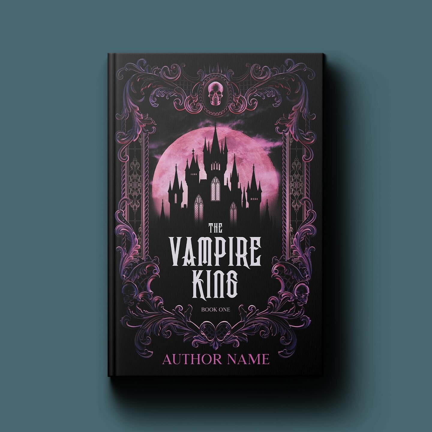
#2: Color Psychology
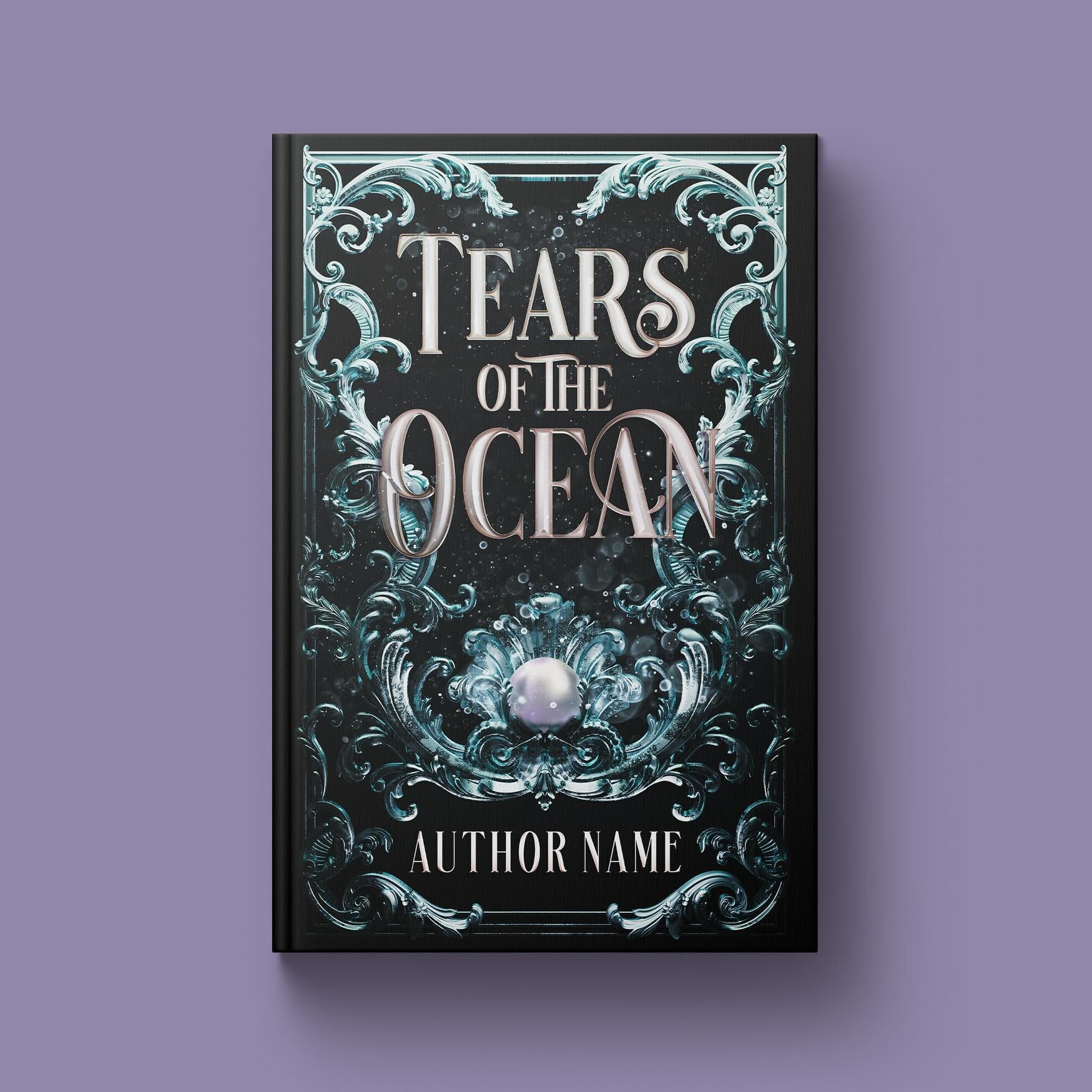
Colors play an integral role in storytelling, vividly conveying emotions and themes that words might sometimes fall short of expressing. In the realm of book cover design, particularly for genres like fantasy romance and fantasy, understanding and effectively utilizing color psychology is imperative.
For example, in a fantasy romance novella, gentle pastels might be used on the cover. Each color is selected carefully to hint at the romance and adventure found in the book.
Let’s explore the tapestry of basic colors and their significance:
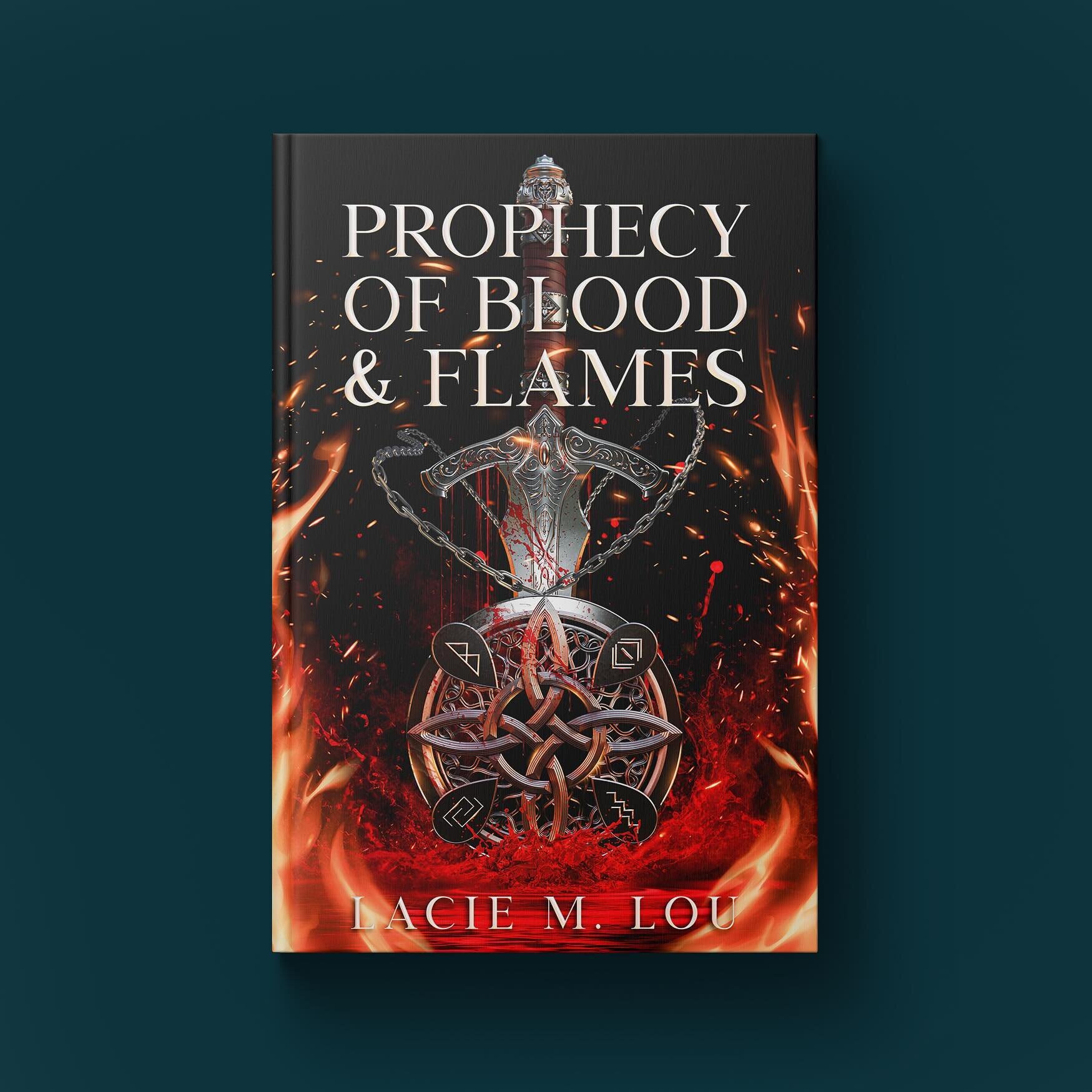
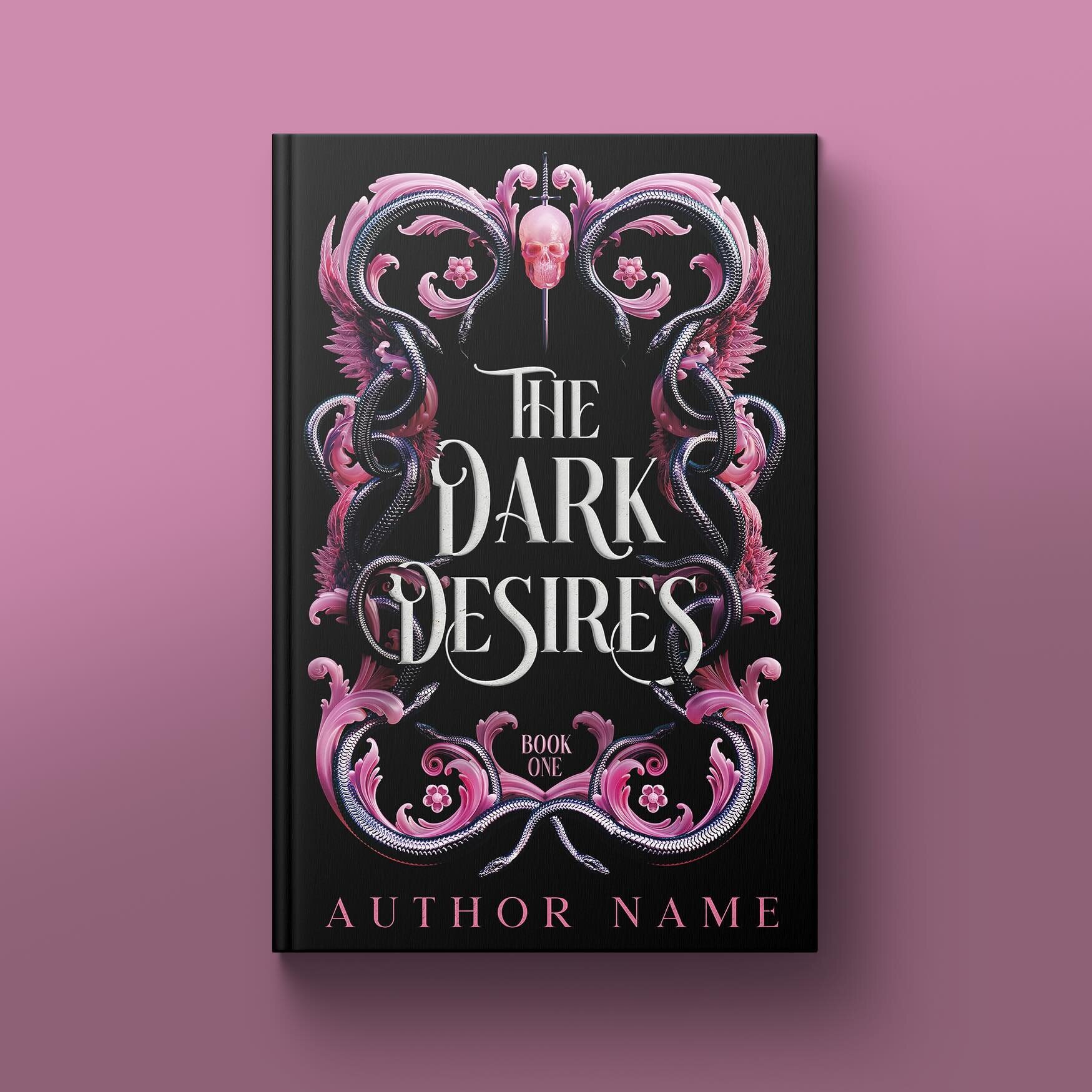
Red: This color, pulsating with vitality and passion, can be seamlessly integrated into fantasy romance covers to signify love, desire, or danger. Think of red as the color of enchanted roses or the fierce eyes of a mythical creature.
Orange: Radiating warmth and adventure, orange can set the stage for a journey through magical lands, perhaps at twilight with the setting sun casting long shadows in an enchanted forest.
Yellow: Symbolic of joy and positivity, yellow can be used to depict happiness or magical realms that are bright, welcoming, and filled with light.
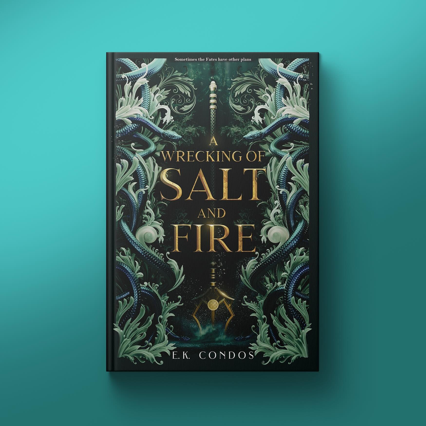
Green: With its close ties to nature and growth, green is ideal for illustrating enchanted forests, mythical beings connected to the earth, or settings where nature’s magic is predominant.
Blue: This calming color can evoke a sense of mystery and depth, perfect for covers depicting night skies, magical springs, or the homes of celestial beings.
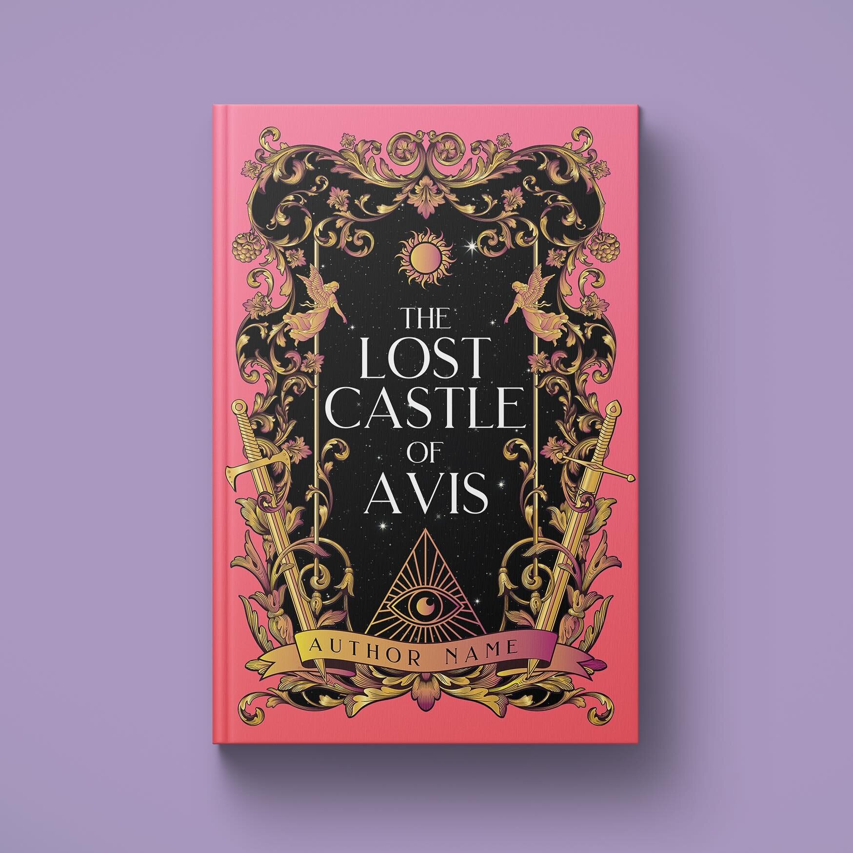
Purple: Often associated with royalty and magic, purple is an excellent choice for conveying a sense of the mystical and the regal, often found in tales of queens and kings, wizards and magical realms.
Black: Black can add a layer of mystery or danger, perhaps representing dark magic, unknown territories, or powerful antagonists in the story.
White: Denoting purity and innocence, white can be used to represent protagonists with a pure heart or magical beings that symbolize hope and light.
Expert designers masterfully blend these colors to evoke deeper, layered emotions and set the mood aptly for the genre. For example, a combination of red and purple might suggest a passionate romance unfolding in a mystical setting. Alternatively, a gradient blending black and green could depict the dangerous allure of forbidden, dark magic in a fantasy tale.
By understanding and cleverly playing with colors, seasoned designers can craft book covers that not only reflect the essence of your fantasy or fantasy romance novel but also resonate emotionally with prospective readers, enticing them to delve into the magical worlds you've created.


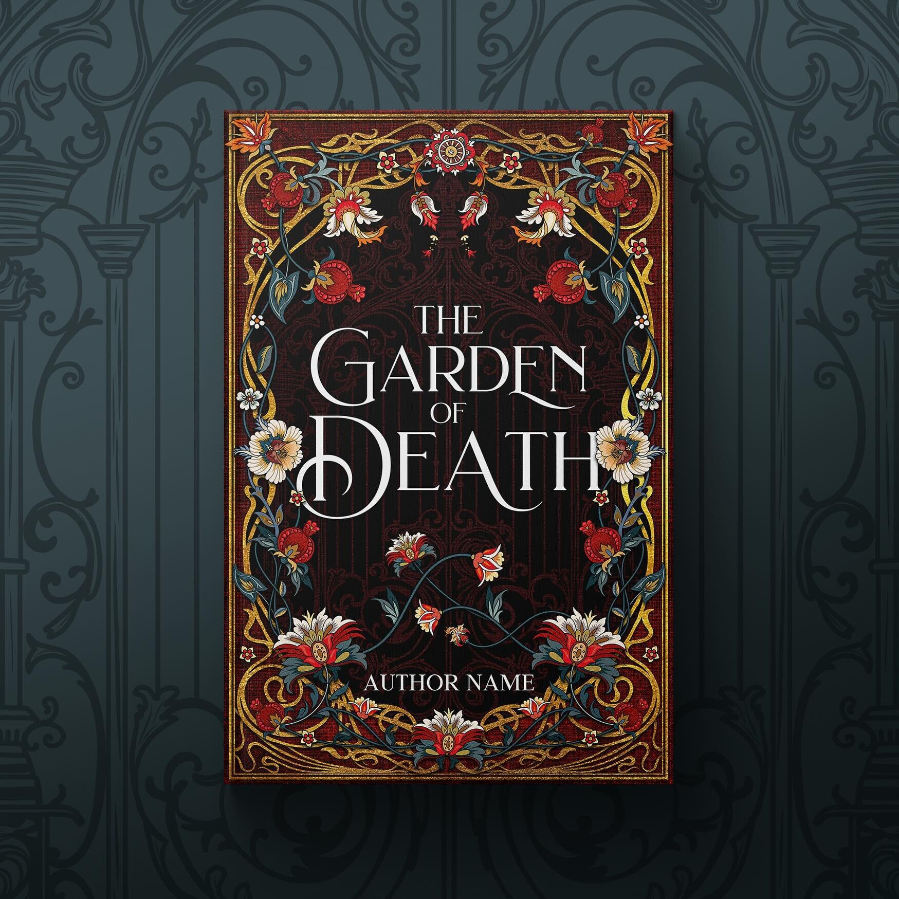
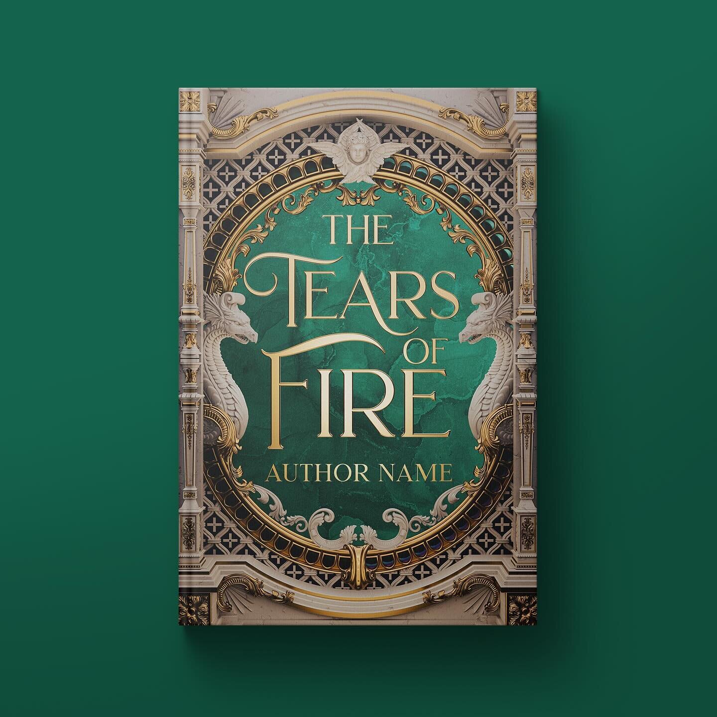
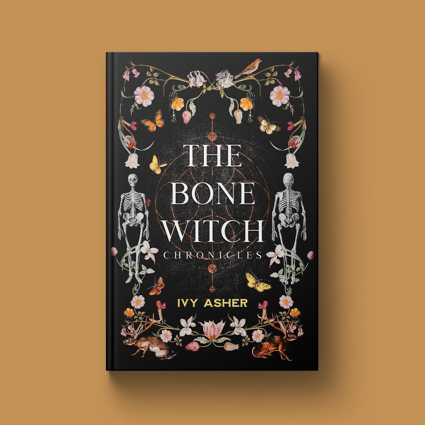
Typography Matters
Selecting the appropriate font is crucial when developing a cover for a fantasy project. Given the saturated market of indie authors and publishers within the fantasy and fantasy romance genres, there’s intense competition. Exploring a variety of typography options is necessary to ensure a book can effectively capture attention and stand out among the rest.
With the influx of new works, the trend within fantasy genres is gradually shifting from traditional, intricate fantasy fonts to designs that are simpler and bolder. This evolution isn't arbitrary but is a response to the changing ways in which readers interact with book covers, especially online.
In the digital realm, a book cover must be legible and compelling even when viewed as a thumbnail. The surge in online book sales and the popularity of e-readers have made this factor crucial. Here, simpler and bolder fonts have the upper hand as they maintain readability and visual appeal at smaller sizes, ensuring that the cover performs effectively across various digital platforms.
Whether adopting a modern, sleek approach or leaning towards typography that echoes timeless elegance, the selected font should not only harmonize with the narrative’s character but also align with the evolving trends and demands of the genre. For instance, a fantasy romance might benefit from a typeface that is both elegant and easily readable, subtly alluding to the tender yet adventurous tales within.
This shift towards simplicity and boldness in typography doesn't mean compromising the enchanting aura that fantasy and fantasy romance book covers are celebrated for. Instead, it's about striking a balance, crafting a cover where the font complements the imagery and color scheme while resonating with readers and adapting to the practical requirements of today’s diverse publishing platforms.
#4: The Rules of Beauty
In addition to adhering to foundational principles of beauty and art—including symmetry, a harmonized color palette, balanced elements, and storytelling—one secret sauce that significantly elevates my cover designs is a unique rule I personally adhere to, named 'Flow'. This principle is crucial for crafting covers that are not only compelling but also harmonious and fluid. In implementing 'Flow', every element on the cover is meticulously designed to emerge seamlessly from the others, creating a beautiful and harmonious synergy where no lines sharply intersect. Instead, each line and form transitions fluidly into the next, enhancing the sense of unity and coherence in the design.
The Rule of Thirds, a timeless and essential guideline, works hand-in-hand with the 'Flow'. By strategically arranging cover elements using the Rule of Thirds, a sense of balance and focus is achieved that captivates the readers’ attention, guiding them through a visually delightful and intriguing journey. When coupled with 'Flow', the cover doesn't just attract eyes; it becomes a magnetic, engaging visual storyteller, weaving a tale that readers can't help but want to explore. This dual approach ensures that each cover isn’t merely aesthetically pleasing, but also a masterful canvas that beckons readers into the story within.
#5: Consistency with Genre
Striking a balance between uniqueness and familiarity in crafting a book cover is an art in itself. While maintaining genre consistency is vital for establishing credibility, it is equally crucial to be open-minded and willing to experiment with your designs. Embracing a modern and sleek approach often makes your book stand out, especially in today's digital age where the first impression of your book cover is typically experienced through a thumbnail image online.
Approaching the design process with flexibility allows for exploration of creative avenues that not only adhere to genre norms but also introduce refreshing elements that capture attention. Being innovative and experimenting with different design elements can yield a cover that not only resonates with your intended readers but also piques the curiosity of a broader audience. Remember, in a sea of thumbnails, a cover that subtly breaks the mold while remaining true to its genre can effectively draw readers in, making them eager to explore the story within.
#6: Scalability
There's a significant trend shift within the realm of major publishing where the efficacy of a book cover is primarily gauged by its appearance and impact at thumbnail size. This transformation is a nod to the digital age's influence, where the initial interaction with a book cover often occurs online. A design might indeed be breathtaking in print, but if it loses its charm and essence when scaled down to a thumbnail, its effectiveness is considerably diminished. In this digital era, a cover's visual appeal and recognizability at smaller sizes have become paramount indicators of its success and ability to attract readers. Thus, it’s crucial to craft designs that not only dazzle in print but also retain their magnetic allure as thumbnails, seamlessly adapting to various sizes and formats while continuing to engage and captivate potential readers.
#7: Test and Get Feedback
Constructive feedback is invaluable. My design journey has seen its fair share of iterations and improvements, significantly guided by insightful input from peers and clients. Actively seek opinions and allow them to guide your refinements, spotlighting both strengths and areas needing improvement in your design.
#8: Keep It Simple
Simplicity in design isn't just a style; it's a strategic compromise between creating a cover that’s visually stunning in print and equally compelling as a thumbnail. While there's a magnetic elegance in minimalist designs, crafting simple covers often presents a unique set of challenges. With fewer elements to work with, each piece must carry significant weight in storytelling, and it requires a designer with experience and finesse to encapsulate the essence of a book with limited visual cues.
Experienced designers excel in this realm, weaving magic by translating the book’s essence into one or two potent elements, making the cover not only a visual delight but also a silent narrator beckoning readers to explore the pages within.

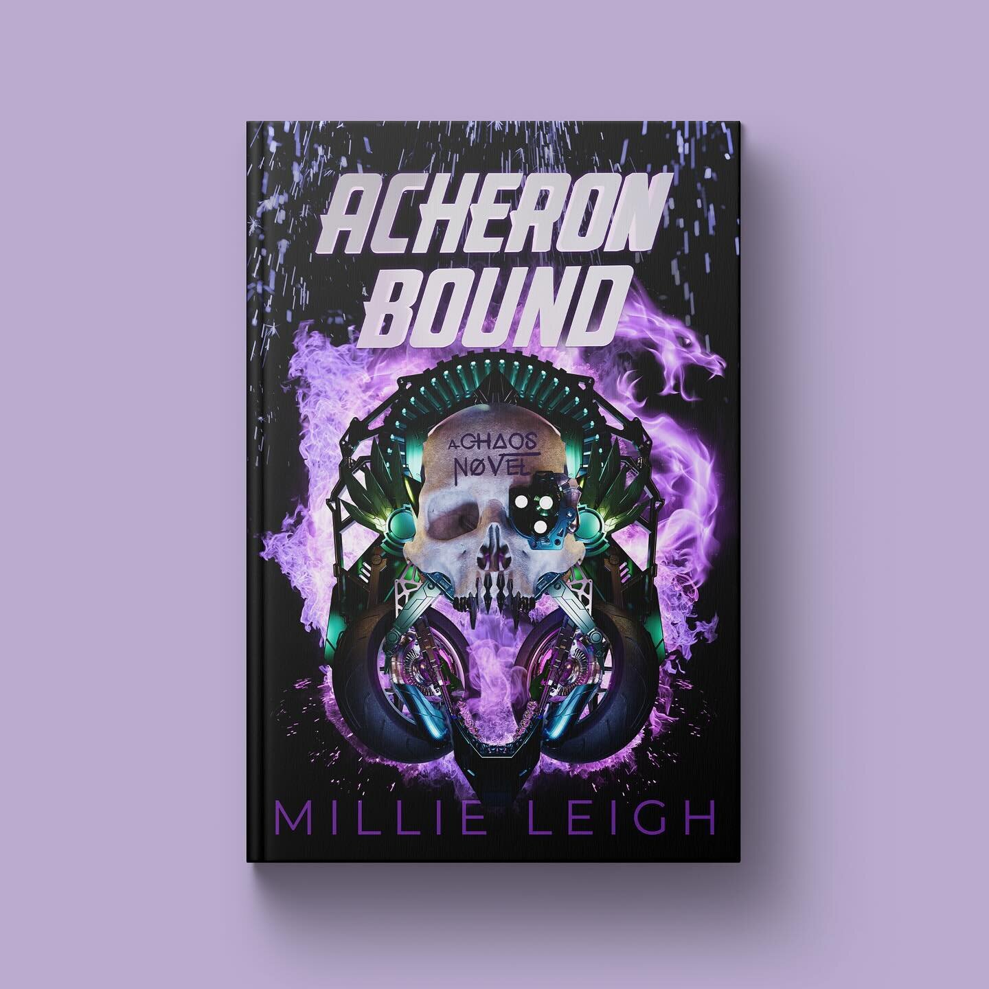
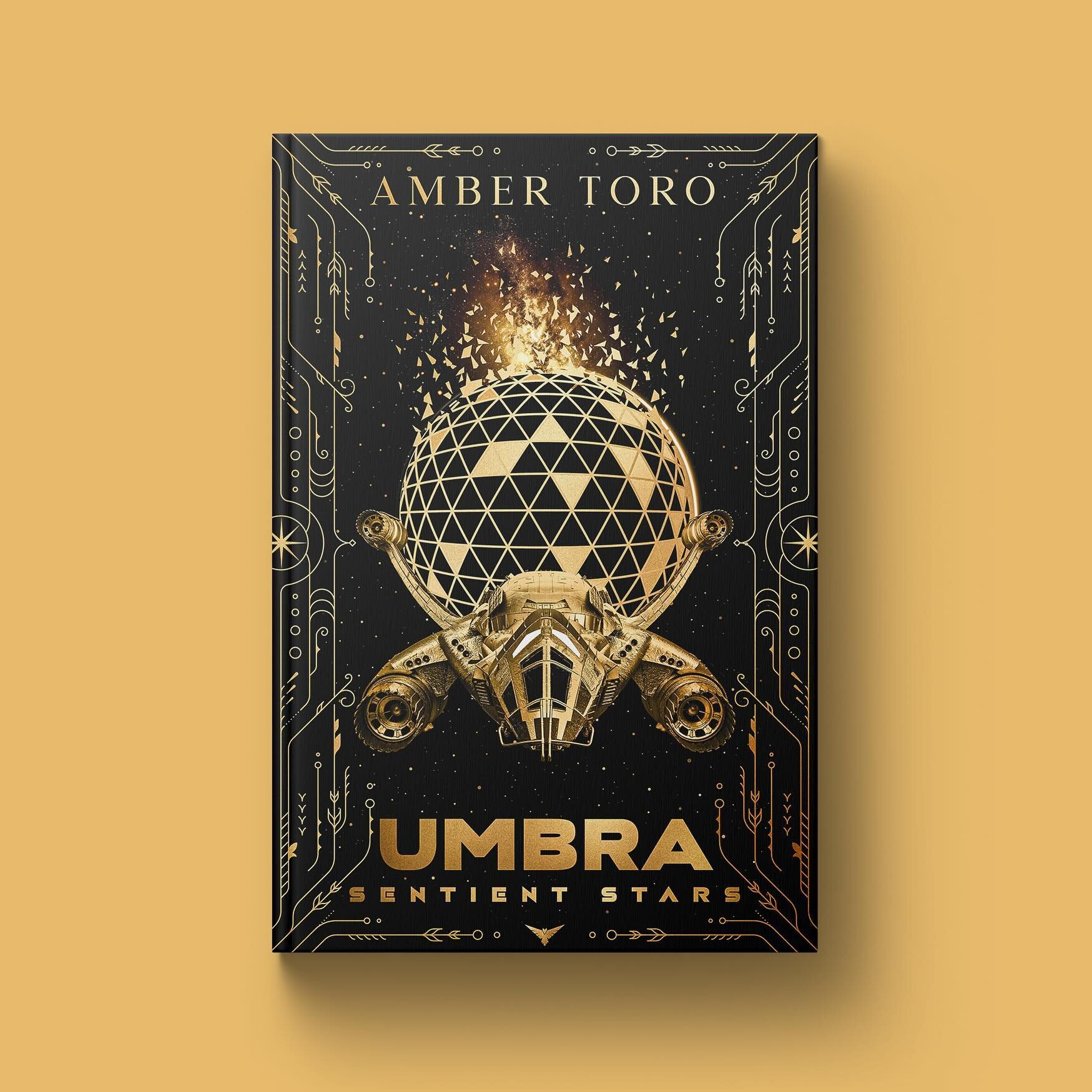
#9: Imagery That Tells a Story
Imagery That Tells a Story" is a vital concept for effective book covers, providing a visual narrative that captures the reader's imagination while succinctly conveying the essence of the book. Creative, thoughtful imagery not only enhances the book's appeal but significantly benefits the author by establishing a memorable and distinctive presence in the reader's mind. Approaching cover design with a fresh and surprising perspective is crucial. It invites intrigue and curiosity, prompting readers to explore the story within. This approach requires thinking beyond clichés and stereotypes, crafting images that are uniquely tailored to the book's content while also resonating with its intended audience. The result is a cover that not only reflects the story's soul but also serves as a powerful marketing tool for the author, contributing positively to their brand and the book’s market success.

#10: Professional Help
Investing in a professional book designer is not merely a strategic move for enhancing your book’s marketability and sales; it's a crucial decision that profoundly impacts your personal brand as an author. Even if you pour immense effort into designing a cover yourself, the refined touch of a seasoned designer can significantly elevate your work, adding a layer of polish and sophistication that unmistakably enhances its appeal to readers.
Professional designers bring to the table a wealth of experience, a keen understanding of market trends, and an adept ability to translate the essence of your writing into a visually compelling narrative on the cover. This expertise is invaluable in a market flooded with books where standing out is paramount.
Engaging with a seasoned designer is, therefore, not just an investment in a single project but a strategic decision that offers long-term benefits for your career as an author, helping to establish a visual style that readers can instantly associate with the unique voice and quality of your writing.
Conclusion
As we conclude this exploration into the art of book cover design, it is evident that a compelling cover is a symphony of carefully considered elements, each playing a crucial role in attracting and engaging potential readers. From understanding your audience to meticulously selecting colors, fonts, and imagery, each design decision contributes to crafting a visual narrative that aligns seamlessly with your book’s essence while appealing to your target readership. Embracing principles like 'Flow' and the Rule of Thirds, while maintaining a balance of simplicity and consistency with your genre, further refines this visual allure.
Now, having unraveled these insights and principles together, the canvas is yours to paint. How will you approach your next book cover design to craft a visual that is as engaging and enchanting as the story within? What story will your cover tell? We would love to hear your thoughts and ideas!
Check out my Portfolio